

 分类:
前端
分类:
前端
哎~!最近各种踏青,停电都遇上了代码的事可能落下好远了吧!!
本人不会制作GIF所以只有静态图了
图:
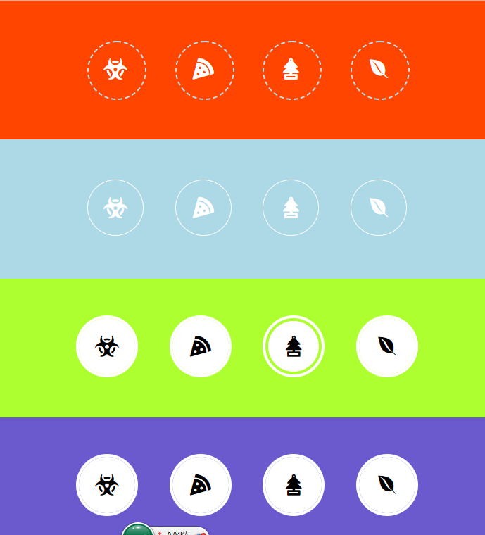
看起来好像还不错,360什么的就不要在意了
html:
<!DOCTYPE html>
<html>
	<head>
		<meta charset="utf-8" />
		<title></title>
		<link rel="stylesheet" type="text/css" href="https://use.fontawesome.com/releases/v5.8.1/css/all.css"/>
		<link rel="stylesheet" type="text/css" href="css/style.css"/>
	</head>
	<body>
		<div class="searwide s1">
			<div class="alist">
				<a href="#" class="fas fa-biohazard"></a>
				<a href="#" class="fas fa-pizza-slice"></a>
				<a href="#" class="fas fa-air-freshener"></a>
				<a href="#" class="fab fa-envira"></a>
			</div>
		</div>
		<div class="searwide s2">
			<div class="alist">
				<a href="#" class="fas fa-biohazard"></a>
				<a href="#" class="fas fa-pizza-slice"></a>
				<a href="#" class="fas fa-air-freshener"></a>
				<a href="#" class="fab fa-envira"></a>
			</div>
		</div>
		<div class="searwide s3">
			<div class="alist">
				<a href="#" class="fas fa-biohazard"></a>
				<a href="#" class="fas fa-pizza-slice"></a>
				<a href="#" class="fas fa-air-freshener"></a>
				<a href="#" class="fab fa-envira"></a>
			</div>
		</div>
		<div class="searwide s4">
			<div class="alist">
				<a href="#" class="fas fa-biohazard"></a>
				<a href="#" class="fas fa-pizza-slice"></a>
				<a href="#" class="fas fa-air-freshener"></a>
				<a href="#" class="fab fa-envira"></a>
			</div>
		</div>
	</body>
</html>
css:
body{
	padding: 0;
	margin: 0;

}
.searwide{
	height: 25vh;
	display: flex;
	justify-content: center;
	align-items: center;
}
.s1{
	background: orangered;
}
.s2{
	background: lightblue;
}
.s3{
	background: greenyellow;
}
.s4{
	background: slateblue;
}
.alist{
	position: relative;
	box-sizing: border-box;
}
.alist a{
	position: relative;
	color: #fff;
	text-decoration: none;
	margin: 0 20px;
	width: 80px;
	height: 80px;
	font-size: 30px;
	cursor: pointer;
	border-radius: 50%;
}
.alist a::before{
	position: absolute;
	left: 50%;
	top: 50%;
	transform: translate(-50%,-50%);
	z-index: 1;
}
.alist a::after{
	content: '';
	left: 0;
	top: 0;
	width: 100%;
	height: 100%;
	border-radius: 50%;
	z-index: 0;
	position: absolute;
}
.s1 .alist a:after{
	border: 2px powderblue dashed;
}
.s1 .alist a:hover::after{
	animation: ro 5s linear infinite;
}
@keyframes ro{
	from{
		transform: rotate(0);
	}
	to{
		transform: rotate(360deg);
	}
}
.s2 .alist a::after{
	border: 1px white solid;
	box-sizing: border-box;
}
.s2 .alist a:hover{
	animation: ro 3s linear infinite;
}
.s3 .alist a{
	color: rgba(0,0,0,1);
	border: 4px white solid;

}
.s3 .alist a::after{
	background-color: white;
	transition: 0.2s;
}
.s3 .alist a:hover::after{
	transform: scale(.9);
}
.s4 .alist a{
	color: black;
	border: 4px white solid;
}
.s4 .alist a::after{
	background-color: white;
	transition: 0.2s;
}
.s4 .alist a:hover{
	color: rgba(0,0,0,0);
}
.s4 .alist a:hover::after{
	transform: scale(.9);
	opacity: 0;
}
2019-04-22 0:51 哇~www!
欢迎加群讨论技术,1群:677373950(满了,可以加,但通过不了),2群:656732739
评价


排名
6
文章
6
粉丝
16
评论
8
{{item.articleTitle}}
{{item.blogName}} : {{item.content}}
ICP备案 :渝ICP备18016597号-1
网站信息:2018-2026TNBLOG.NET
技术交流:群号656732739
联系我们:contact@tnblog.net
公网安备: 50010702506256
50010702506256

欢迎加群交流技术